Last updated at Fri, 22 Dec 2023 20:18:17 GMT
The much-anticipated, tenth-anniversary edition of the Verizon DBIR has been released (Updated here: https://www.verizon.com/business/resources/reports/dbir/), once again providing a data-driven snapshot into what topped the cybercrime charts in 2016. There are just under seventy-five information-rich pages to go through, with topics ranging from distributed denial-of-service (DDoS) to ransomware, prompting us to spin a reprise edition of last year's DBIR field guide (2016 Verizon DBIR Summary).
Before we bust out this year's breach-ography, let's set a bit of context.
The Verizon DBIR is digested by a diverse community, but the lessons found within are generally aimed at defenders in organizations who are faced with the unenviable task of detecting and deterring the daily onslaught of attacks and attackers. This post is also aimed at that audience. As you go through the Verizon DBIR, there should be three guiding principles at work:
- How do I use this information to improve my organization's threat response time?
- How do I use this information to improve my resistance strength (http://www.fairinstitute.org/blog/threat-capability-and-resistance-strength-a-we ight-on-a-rope)?
- How do I use this information to increase the time it takes attackers to accomplish their goals?
Time to fire up the jukebox and see what's inside.
The Detection-Deficit is Dead…Long Live the Defender's Differential!
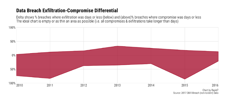
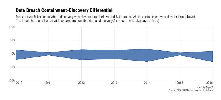
The first chart I always went to in the DBIR was the Detection-Deficit chart. Said chart “compared the percentage of breaches where the time-to-compromise was days or less against the percentage of breaches where the time- to-discovery was days or less.” (VZDBIR, pg 8). It's also no longer an artifact in the Verizon DBIR.
The Verizon Security Research team provided many good reasons for not including the chart in the report, and also noted several caveats about the timings that you should take time to consider. But, you still need to be tracking similar metrics in your own organization to see if things are getting better or worse (things rarely hold steady in infosec land). We've taken a cue from the DBIR and used their data to give you two new metrics to track: the “Exfiltration-Compromise Differential”
and the “Containment-Discovery Differential”.
The former chart shows a band created by comparing the percentage of breaches where exfiltration (you can substitute or add-in other accomplished attacker goals) was in “days or less” (in other words, less than seven days) to those when initial compromise was “days or less”. This band should be empty (all attacker events took days or longer) or as tiny as possible.
The latter does the same to compare the defender's ability to detect and contain attacker activity. That band needs to be as YUGE as you can make it (aligned to your organization's risk and defense spending appetites).
As noted in the Verizon DBIR, things aren't getting much better (or worse) when looked at in aggregate, but I'm hopeful that organizations can make progress in these areas as tools, education, techniques and processes continue to improve.
Some other key takeaways in the “Breach Trends” section include:
- The balance between External and Internal actors has ebbed-and flowed at about the same pace for the past 7 years, meaning Figure 2 does not validate the ever-present crusade by your Internal Audit department to focus solely on defending against rogue sysadmins. There is a cautionary tale here, though, in that many of the attacks marked as “internal” were actually committed by external attackers who used legit credentials to impersonate internal users.
- We have finally reached the Threat Action Trifecta stage with Social, Malware and Hacking reigning supreme (and will likely do so for some time to come).
- Financial gain and stealing secrets remain primary motives (and defending against those who seek your secrets may become job #1 over the coming years if Figure 3 continues the trend).
Team DBIR also provided a handy punch-card for you in Figure 9:
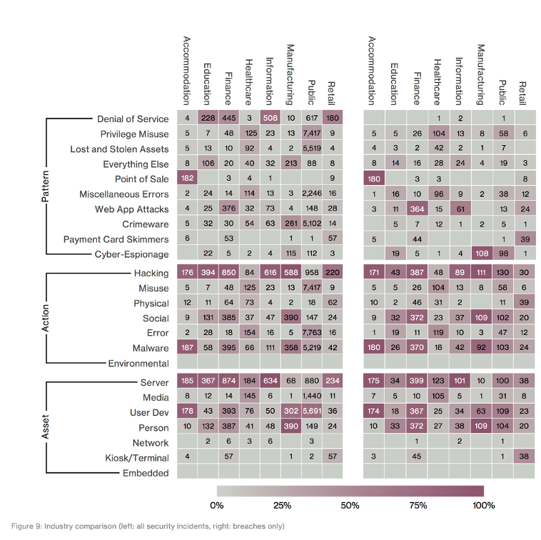
It's your “at-a-glance” key to the 2016 chart-toppers by industry. Keep it handy as you sit in your post-DBIR-launch roadmap adjustment meetings (you do have those, right?).
The Secret Life of Enterprise Vulnerability Management (Guest starring IoT)
Verizon has many partners who provide scads of vulnerability data, and the team took a very interesting look at patching in the intro section preceding the individual industry dives.
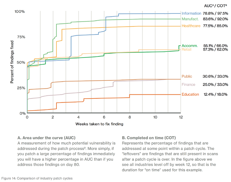
Verizon gives a solid, technical explanation of this chart, so we'll focus on how you should benchmark your own org against it.
Find your industry (NAICS codes are here: North American Industry Classification System but you can also Google™ “COMPANY_NAME NAICS” and usually get a quick result) on the right then hit up your vulnerability and patch management dashboards to see if you meet or beat expectations. If you're a college, do you patch more than 12% of vulns in 12 weeks-time? If you're in a hospital, do you meet the 77% bar?
The chart is based on real data from many organizations. You may have some cognitive dissonance reading it because we constantly hear how awesome, well-resourced financial institutions are at IT & security and the converse for industries such as Healthcare. One way to validate these findings is to start tracking this data internally, then getting your ISAC partners (you are aligned with one — or more — information sharing and analysis centers, right?) to do the same and compare notes a few times a year. You also need to define your own targets and use your hit/miss ratio as a catalyst for process improvement (or funding for better tooling).
But wait…there's more!

Keep one finger on page 13 and then flip to Appendix B to get even more information on vulnerability management, including this chart >
Network ops folks patching on 90-day cycles shouldn't really surprise folks - we need to keep those bits and bytes flowing and error-free high-availability switchover capability is expensive - but take a look at the yellow-ish line. First, do you even track IoT (Internet of Things, i.e. embedded) patching? And, if you do — or, when you start to after reading this — will you strive to do better than the “take 100 days to not even get half the known vulns patched”?
IoT is a blind-spot in many (most) organizations and this chart is a great reminder that you need to:
- care about
- inventory/locate, and
- track
IoT in your environment.
Industrial Development
Unfortunately, digesting the various Industry sections of the Data Breach Investigations Report is an exercise that you must — dear, reader — undertake on your own, but they are a good resource to have for planning or security architecture development session.
Find your industry (see the previous section in this post), note the breach frequency (they'll likely have fixed the bug in the Accommodation section by the time our blog post drops), top patterns, actor information and compromise targets and compare your 2016 to the overall industry 2016. Note the differences (or similarities) and adjust accordingly.
The DBIR team provides unique details and content in each industry section to help you focus on the differentials (the unique incident characteristics that made one industry different from each other). As you go through each, do not skip over the caveats. The authors of the report spend a great deal of time sifting through details and will often close out a section with important information that may change your perspective on a given area, such as this closing caveat in the Retail section: “This year we do not have any large retailers in the Point of Sale Intrusions pattern, which is hopefully an indicator of improvements and lessons learned. We are interested in finding out if smaller retailers also learned this lesson, or if single small breaches just aren't making it into our dataset.”
The Last Waltz: Dancing Through Incident Classification Patterns
We'll close with an overview of the bread-and-butter (or, perhaps, avocado toast?) of the DBIR: the incident classification patterns. Figures 33 & 34 provides the necessary contextual overview:
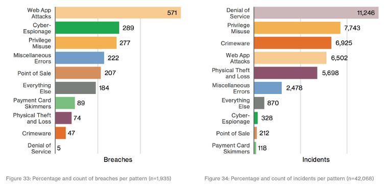 Breaches hurt, but incidents happen with more regularity, so you need to plan for both. First, compare overall prevalence for each category to what your own org saw in 2016 so you understand your own, unique view.
Next, make these sections actionable. One of the best ways to get the most out of the data in each of the Patterns sections is to take one or two key details from each that matter to your industry (they align the top ones in each category) and design either tabletop or actual red-team exercise scenarios that your org can run through.
For example, design a scenario where attackers have obtained a recent credential dump and have targeted your employee HR records (yes, I took the easy one from Figure 52, page 58). MITRE has a decent “Cyber Exercise Playbook” you can riff off of if you don't have one of your own to start with.
Coda
This is the first year Rapid7 has been a part of the DBIR corpus and we want to end with a shout-out to the entire DBIR team for taking the time to walk through our incident/breach-data contributions with us and look forward to contributing more —and more diverse — data in reports to come.