Last updated at Fri, 21 Jul 2017 19:38:48 GMT
One of the most strenuous aspects of managing your security program is understanding where to focus your time and effort. It can be a challenge to balance providing consistent progress updates to your stakeholders and working with your IT teams to prioritize and remediate issues based on the most accurate data available at that time. Communication is critical, yet how do you know what to target and how do you share this information with your organization? Nexpose has the perfect tool to help you achieve your security goals and communicate your status to your team. With the introduction of the Risk Scorecard report you can see where you are doing well, what areas need work, and where to invest more time and resources. Based on the popular Community report, Site Report Card, the Risk Scorecard report includes all of your favorite features plus some awesome new ones and a slick interface that will enhance the visual communication of your data.
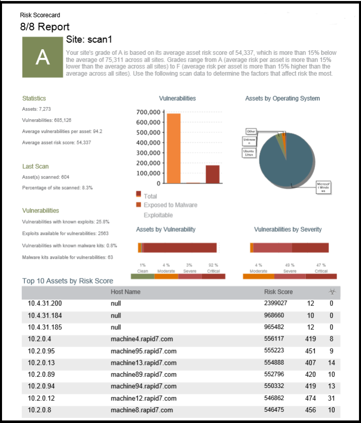
The Risk Scorecard report provides grades for each of your Nexpose groups which can be organized by Sites, Tags, or Asset Groups based on how you want to organize your environment. The grading system works on the A through F range and is based on a curved scale system of your environment. The grade works by calculating the average risk of assets within the grouping type (Site, Asset Group, or Tag). This average becomes the curve that each unit is graded against. Reporting on a larger number of components is recommended so you see more variety and accuracy in your graded results. The grading framework works by calculating the average risk of the assets within a group for each asset in scope. The average of this average sets the curve. From there, the curve is defined in the following way:
- A - a group's average risk per asset is more than 15% lower than the average
- B - a group's average risk per asset is between 5% and 15% lower than the average
- C - a group's average risk per asset is within 5% of the average
- D - a group's average risk per asset is between 5% and 15% higher than the average
- F - a group's average risk per asset is more than 15% higher than the average
Because these grades are based on a curve, they are relative to your environment and will help you to determine what areas need the most attention based on the specific security needs of your environment. You can use this data to compare sites in ways that make the most sense for you based on how you group your assets. You can compare based on Sites, Asset Groups, or Tags within the scope of this report.
For example, let's say you tag your assets based on office locations: Los Angeles, Miami, and New York. You can use the Risk Scorecard report to compare those three locations to each other. Los Angeles receives an A grade in the report, but Miami and New York both get Ds. The Risk Scorecard report provides you with breakdowns of information such as asset counts, vulnerabilities by severity, and available exploits so you can do a quick, side by side comparison to see what is making the security of one office more successful than the others. As a result, this report helps you to have the conversations you need to have with your IT teams and use this report as your points of comparison. It enables you to share with them how they are performing and how to improve your overall risk posture.
