Last updated at Tue, 25 Apr 2023 20:24:14 GMT
Admit It, You Love Color!
Any of the Rapid7 products you use involves interacting to some extent with color. Living in a achromatic world would be dull, compared to a world drenched in colors. Why? Because, color helps us in a number of ways. It can:
- Help us to distinguish one object from another
- Cause actions and reactions
- Influence our thinking
- Play an important role in conveying quantitative information.
Imagine an air traffic control center whereby the colors used to convey data are inaccurate, poorly chosen color schemes. These will only serve to distort the message that the data values are meant to convey, instead of making them clearer. Miscommunication would be inevitable. This leads us to an interesting question—what is a good color scheme?
Staying with the aerospace theme for a moment, information designers within that industry face the difficult challenge of creating clear data visualizations from complex data sets across their applications. But this is not a problem that needs to be solved only for aerospace information designers. Information Security application designers face similar challenges.
How Designers Consider Color
Because of the similarities in the design of interfaces that use color across industries, there (not surprisingly) is a standard process. Let's look at that for a moment:
Phase 1: Data Planning
Step 1: Compile a data inventory
Step 2: Plan for management of users' attention
Phase 2: Design of Graphics
Step 3: Design perceptual layers
Step 4: Decide where chromatic color will be used and why
Step 5: Choose colors
Step 6: Solve problems
During this process, designers go through a color-determination process—let's look at the process in more detail:
Step 1: Compile a data inventory. This step involves determining what information should be displayed on each screen, the goal of each screen, who will use the screen, and its purpose.
Step 2: Plan for management of user's attention: This step is about prioritizing the data and its importance relative to the user, depending upon desired activity for each screen or task flow. This is an important step, as it is the step in which a designer creates Urgency Hierarchies. Urgency Hierarchies are created in order to reduce “clutter” in designs in which a considerable amount of data needs to be presented at one time. For people who are not familiar with Urgency Hierarchies, the word “clutter” just sounds like picking unnecessary vectors and deleting them from a document. In the design world, when clutter happens the user will struggle to read or locate material needed for decision-making. To reduce the cognitive load of high density pages of data, designers can use color to emphasize or de-emphasized important information.
Step 3: Designing Perceptual Layers, or creating graphics that support user tasks. When choosing colors for graphics, designers need to consider things like contrast polarity, in other words, will the colors live on a radar-like (bright symbols on dark backgrounds) or map-like (dark symbols on light) display? Both options have been proven to be successful, yet both have pros and cons.
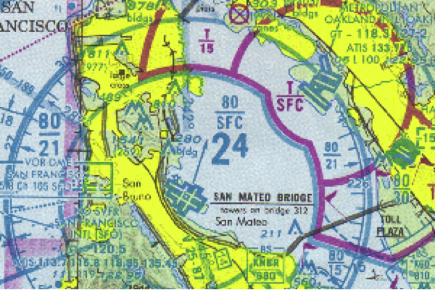
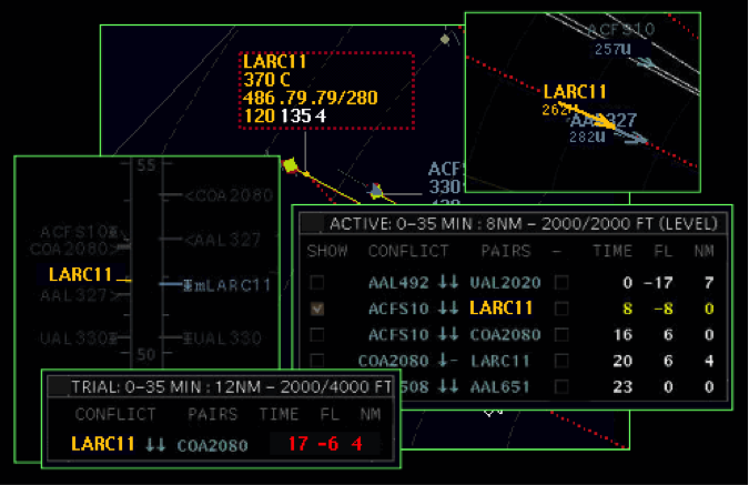
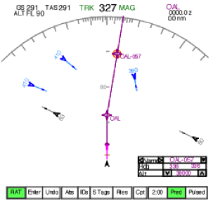
Large blocks of texts are more legible on a white background, but other things such as eye-strain, glare, context of use (in dark or bright environments) should also be taken into consideration. The designer needs to decide what needs to be visually prominent and then determine if the goal will be better attained using a radar tactic or a map. Visibility and importance can be manipulated by adjusting luminance contrast, size, line weight and chromatic color, and the goal of the graphic needs to be considered simultaneously. In the instances below, aerospace information designers group data with color:
Color is Powerful
As we can see, color can be utilized as a powerful tool for visually displaying information. But when overused, it will reduce visual associations. Use of color, therefore, should be used only to highlight critical information, so that those data points are unique, and therefore, the most visually salient elements on the screen.
This is something we are always exploring at Rapid7. For example, as part of our Customer Voice Program, we recently asked customers to view data graphs with different color treatments (Figure 4) to obtain feedback on the design and use of color.
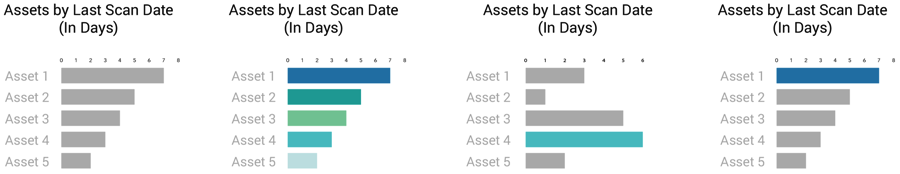
When asked which graph would be most useful in the context of their Information Security work, two customers responded:
“For anything critical, this type of graph (graph 3) would appeal to me, to help get down to the critical as soon as possible”
“For the boots on the ground folks, that we're trying to fight fires and solve the problems, graph number 3 would be the preference”
In summary, while color is aesthetically pleasing, we must consider the function of color in design, the goals of the consumers of that data, and the context in which the design will be consumed, and design accordingly. We would love to hear your thoughts on how color can best be utilized within Information Security Design. To help us to design our applications from your perspective, visit the Rapid7 Voice Program website, or email Rapid7voice@rapid7.com.
Thank you for reading!
Zarah Delrosario
Visual Designer, Rapid7